Friday, December 2, 2011
Thanks to San Marcos High School & Mr. DeVries!
Thanks so much for spending your time with me today. I hope that I was able to answer your questions and get your creative juices flowing! I'm going to post some logo design tips on this blog for you so check back soon! Good luck with your event.
Logo Design for Smarties
Here are some tasty rules for logo design that will help you kick-start your creativity.

1. KEEP IT SIMPLE
Your mission in designing a logo is to convey a message quickly and elegantly. Really great logos feature something unique without being overworked.


The WWF logo is a genius example of the power of simplicity. This clever logo utilizes positive and negative space in such an elegant way that it's immediately recognizable. And it looks great on a t-shirt!

Milton Glaser, who designed the famous I LOVE NY logo had this to say about simplicity in logo design in a recent interview.
...you don’t want to be to complex, you want to have an internal joke, you want to move the viewer in a perception so that when they first look at it, maybe they don’t quite understand it, and then a fraction of a second later, they get the idea, because that act between seeing and understanding is critical, and a good logo, you look at it and there’s a little jump before you understand it. That’s the success of the "I LOVE NY" because you have to translate it from "I" which is a complete word to "heart" which is a symbol for feeling to "NY" which are initials for a place. ________________________________________________________
Simplicity can be beautiful. You have probably heard the phrase "beauty is in the eye of the beholder". Although this can be true for dogs, it really isn't true for logos. A bad logo is a bad logo is a bad logo.
Ugly dog?

If you're another purebred Chinese Crested this is a beautiful dog,
warts and all.
Ugly logo?

Not even it's mother could love this logo. It's just too darn ugly. Bad readability and the faded patriotic image in the background are just the beginning of this logo's many problems. Can you see any others?
________________________________________________________2. MAKE IT UNIQUE
Your logo has to stand out from the pack. Do your research to see what similar companies or organizations are using for their logos and DON'T do the same thing. For example, if you are designing a logo for a coffee company, the last thing you want to do is make it look like the Starbucks logo. There are lots of copycats out there and your job is to make your client stand apart - not blend in.
DON'T LET THIS HAPPEN TO YOUR LOGO!


On the top, the Rocket Dog shoe company logo designed ten years ago. On the bottom, a newer logo for a small cafe. Hmmm.

On the left, a coffee company in Korea registered this logo in 2003. On the right, the Starbucks logo. Even though the Intellectual Property Tribunal in South Korea ruled that the logos were different enough to not cause confusion in the marketplace, I would have a hard time sleeping at night if I were the designer of the Starpreya logo!
________________________________________________________
3. MAKE IT TIMELESS
Ok, that may be easier said than done. My point here is to not design a logo using trendy typefaces or other graphic gimmicks that might be popular right now. You want your logo to look fresh for years. This is not to say that it won't need a redesign 10 years down the road–very few logos can last the test of decades–but you don't want it to look dated in a year.

This version of the IBM logo was designed in 1972 by Paul Rand. It's still in use today.
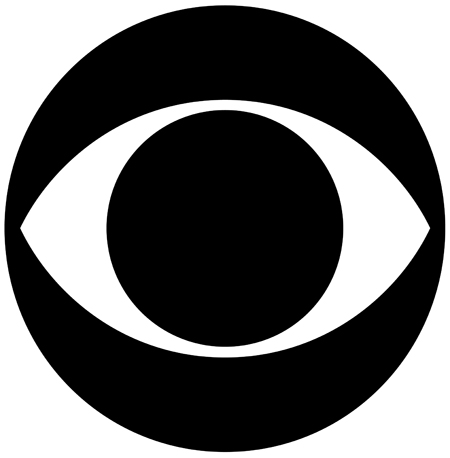
The CBS "Eye" logo first appeared on the air in 1951 and was designed by William Golden.

The "moustache" logo below looks really out of date, but I'm sure it was totally awesome in 1982!
________________________________________________________
4. MAKE IT ADAPTABLE
A logo should be just as readable whether it's on a skyscraper, on a bumper-sticker or on a postage stamp. Also, it needs to look good whether it's in color or black & white. If you design your logo using a vector program such as Adobe Illustrator you will assure that your logo will stay clean whether it's tiny or blown up to billboard size.

The Target logo is so clean and versatile you can put it on a dog's face and it is still instantly recognizable.
________________________________________________________
4. MAKE IT APPROPRIATE
Before you even start designing your logo think about your client and your client's audience. Is the logo for a law firm? Or a charity? Or a kid's store? You have to consider the use of typography, imagery and color for your audience. A law firm probably wouldn't want a bright pink logo and you probably wouldn't want to use an old English typeface for a baby-sitting service (too scary). Typefaces and colors say a lot about the culture of your client.
Sometimes you might think you've come up with the perfect idea for a logo, but if your client isn't sold, it's back to the drawing board. You need to let go of your ego a little bit but keep pushing yourself hard to get the right solution.
Keep in mind that logo design is hard! The best logos look like they designed themselves – and that's the hardest trick of all.
Some more awesome logos:


1. KEEP IT SIMPLE
Your mission in designing a logo is to convey a message quickly and elegantly. Really great logos feature something unique without being overworked.
The WWF logo is a genius example of the power of simplicity. This clever logo utilizes positive and negative space in such an elegant way that it's immediately recognizable. And it looks great on a t-shirt!
Milton Glaser, who designed the famous I LOVE NY logo had this to say about simplicity in logo design in a recent interview.
...you don’t want to be to complex, you want to have an internal joke, you want to move the viewer in a perception so that when they first look at it, maybe they don’t quite understand it, and then a fraction of a second later, they get the idea, because that act between seeing and understanding is critical, and a good logo, you look at it and there’s a little jump before you understand it. That’s the success of the "I LOVE NY" because you have to translate it from "I" which is a complete word to "heart" which is a symbol for feeling to "NY" which are initials for a place. ________________________________________________________
Simplicity can be beautiful. You have probably heard the phrase "beauty is in the eye of the beholder". Although this can be true for dogs, it really isn't true for logos. A bad logo is a bad logo is a bad logo.
Ugly dog?
If you're another purebred Chinese Crested this is a beautiful dog,
warts and all.
Ugly logo?
Not even it's mother could love this logo. It's just too darn ugly. Bad readability and the faded patriotic image in the background are just the beginning of this logo's many problems. Can you see any others?
________________________________________________________2. MAKE IT UNIQUE
Your logo has to stand out from the pack. Do your research to see what similar companies or organizations are using for their logos and DON'T do the same thing. For example, if you are designing a logo for a coffee company, the last thing you want to do is make it look like the Starbucks logo. There are lots of copycats out there and your job is to make your client stand apart - not blend in.
DON'T LET THIS HAPPEN TO YOUR LOGO!
On the top, the Rocket Dog shoe company logo designed ten years ago. On the bottom, a newer logo for a small cafe. Hmmm.
On the left, a coffee company in Korea registered this logo in 2003. On the right, the Starbucks logo. Even though the Intellectual Property Tribunal in South Korea ruled that the logos were different enough to not cause confusion in the marketplace, I would have a hard time sleeping at night if I were the designer of the Starpreya logo!
________________________________________________________
3. MAKE IT TIMELESS
Ok, that may be easier said than done. My point here is to not design a logo using trendy typefaces or other graphic gimmicks that might be popular right now. You want your logo to look fresh for years. This is not to say that it won't need a redesign 10 years down the road–very few logos can last the test of decades–but you don't want it to look dated in a year.

This version of the IBM logo was designed in 1972 by Paul Rand. It's still in use today.
The CBS "Eye" logo first appeared on the air in 1951 and was designed by William Golden.
The "moustache" logo below looks really out of date, but I'm sure it was totally awesome in 1982!
________________________________________________________
4. MAKE IT ADAPTABLE
A logo should be just as readable whether it's on a skyscraper, on a bumper-sticker or on a postage stamp. Also, it needs to look good whether it's in color or black & white. If you design your logo using a vector program such as Adobe Illustrator you will assure that your logo will stay clean whether it's tiny or blown up to billboard size.
The Target logo is so clean and versatile you can put it on a dog's face and it is still instantly recognizable.
________________________________________________________
4. MAKE IT APPROPRIATE
Before you even start designing your logo think about your client and your client's audience. Is the logo for a law firm? Or a charity? Or a kid's store? You have to consider the use of typography, imagery and color for your audience. A law firm probably wouldn't want a bright pink logo and you probably wouldn't want to use an old English typeface for a baby-sitting service (too scary). Typefaces and colors say a lot about the culture of your client.
Sometimes you might think you've come up with the perfect idea for a logo, but if your client isn't sold, it's back to the drawing board. You need to let go of your ego a little bit but keep pushing yourself hard to get the right solution.
Keep in mind that logo design is hard! The best logos look like they designed themselves – and that's the hardest trick of all.
Some more awesome logos:
Thursday, December 1, 2011
Poster Design 101
...or How to Design an Awesome Poster that Will Bring Millions to Your Event! (results may vary)
Design Your Poster Around a Central Image

This famous poster designed by Saul Bass for the movie Vertigo relies on a strong central image to get it's message across. It pulls your eye in like a target!

This beautiful poster uses a centered design in a more subtle way. The eye is drawn to the glow of light in the center of the image.

Rules Are Made to be Broken (sort of). Although the main graphic element for this poster is off-center, the designer draws your eye to the center of the composition through careful placement of the graphic elements, color and white space.
__________________________________________________________
Research! Research! Research!
What is the theme of your poster? For an Evening in Paris you can research some of the most amazing French Poster Designs of ALL TIME! You could get very inspired by their work and let it inspire your design (but, please, don't copy)!

A.M. Cassandre designed amazing graphic posters in the art deco style. Research his work. It's inspiring!

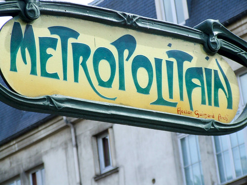
Alphonse Mucha was a famous designer working in Paris during the Art Nouveau period. His illustration style echos the type used in the famous Paris Metro signage.
__________________________________________________________
Which brings us to the next subject. Research all things Parisian! You might want to incorporate Parisian Fashion, Art or Architecture into your poster.

Art Nouveau entrance to Paris Metro.

The world famous Eiffel Tower.
__________________________________________________________
Take what you've discovered in your research and start designing! Try to think of new and interesting ways to represent your subject in your poster.

This poster cleverly uses typography to illustrate the Eiffel Tower.

A creative illustration of the Paris skyline about to be attacked by Godzilla..
 The Eiffel Tower "running" along the Seine. Combining images (such as the Eiffel Tower with human legs) is called a Fused Metaphor.
Some links.
http://psdcollector.blogspot.com/2011/01/poster-design-50-amazing-examples.html
http://speckyboy.com/2010/08/10/30-creative-and-inspiring-poster-designs/
http://www.1stwebdesigner.com/design/conventions-poster-design-inspiration/
Design Your Poster Around a Central Image
This famous poster designed by Saul Bass for the movie Vertigo relies on a strong central image to get it's message across. It pulls your eye in like a target!
This beautiful poster uses a centered design in a more subtle way. The eye is drawn to the glow of light in the center of the image.
Rules Are Made to be Broken (sort of). Although the main graphic element for this poster is off-center, the designer draws your eye to the center of the composition through careful placement of the graphic elements, color and white space.
__________________________________________________________
Research! Research! Research!
What is the theme of your poster? For an Evening in Paris you can research some of the most amazing French Poster Designs of ALL TIME! You could get very inspired by their work and let it inspire your design (but, please, don't copy)!
A.M. Cassandre designed amazing graphic posters in the art deco style. Research his work. It's inspiring!
Alphonse Mucha was a famous designer working in Paris during the Art Nouveau period. His illustration style echos the type used in the famous Paris Metro signage.
__________________________________________________________
Which brings us to the next subject. Research all things Parisian! You might want to incorporate Parisian Fashion, Art or Architecture into your poster.
Art Nouveau entrance to Paris Metro.
The world famous Eiffel Tower.
__________________________________________________________
Take what you've discovered in your research and start designing! Try to think of new and interesting ways to represent your subject in your poster.

This poster cleverly uses typography to illustrate the Eiffel Tower.
A creative illustration of the Paris skyline about to be attacked by Godzilla..
Some links.
http://psdcollector.blogspot.com/2011/01/poster-design-50-amazing-examples.html
http://speckyboy.com/2010/08/10/30-creative-and-inspiring-poster-designs/
http://www.1stwebdesigner.com/design/conventions-poster-design-inspiration/
Friday, June 4, 2010
toasty arms

This idea brought to you by my incredibly fashion-savvy friend, Marcia. She picked up a few light knit arm warmers on sale today for those notorious chilly Southern California nights. Say you are out all day enjoying 85° summer weather when suddenly you find yourself far from home after the sun goes down. The temp dips to a brisk 55°, you whip out your handy-dandy arm warmers and voila, your arms are nice and toasty again. AND you don't have to haul a sweater around all day - annoying!
You can get them in a variety of colors on the cheap so you can always have something to work with your outfit.
Thursday, June 3, 2010
Rockford Files Marathon

This week hubby and I are enjoying watching our favorite 1970s detective show. Since LOST is over and 30 Rock is on summer vacation there's a dearth of worthy television to be watched. Jim Rockford fits the bill nicely.

Subscribe to:
Posts (Atom)
